

Responsibilities
UI / UX
Art Direction
-
Mission
To create an online experience which supports the 502 Bad Gateway printed publication.
About
502 Bad Gateway was created to tell the stories behind menswear brands, people and enthusiasts who do interesting and thought provoking things. 502 features longer reads and interviews that go deeper than whatever new trend it is.
Target Audience
Anyone with an interest menswear, design or lifestyle topics.
Technical Requirements
Subscribe to email notifications / magazine
Analytics / Tracking
E-commerce
Accessible / available on all devices
Goals for Online Experience
Convert online readers / followers to paying customers / subscribers
Increase brand awareness / online presence
Increase sales
Increase offering (merch)
Look & Feel
The 502 website must be aesthetically pleasing. The look needs to be future forward, uncluttered and easily legible – modern type is a must.
Proto Persona

Generative User Research Goals (Qualitative)
To understand the relationship between a publication’s physical product (magazine) and its online platform
To uncover any insights on how we can convert online readers / followers to paying customers / subscribers
Findings via Affinity Mapping
State of print
“It’s thriving, there’s just a lot of it. It’s almost better to do something that’s not in retail stores and subscription based where you get sent it every month.”
Frequency purchasing print
“I haven’t bought a magazine in a very long time, sadly I only read on my phone”
Frustrations
“I’m frustrated by how much stock there is, it’s overwhelming”
Reading habits
“I probably don’t read as much as I should.”
'“I always read on my phone, whatever I read has to be legible on mobile.”
“I substitute traditional reading with podcasts.”
What I read
“Medium, because it tells me how long an article is.”
Tech Habits
“I feel like I’m inundated with interaction and notification from my phone all day long and I find it incredibly stressful.”
Persona

Problem Statement
Rory needs a way to access interesting content because he would like to read more and find entry points / new information on menswear and lifestyle topics.
How might we?
How might we give users legible content on their phones?
How might we help users subscribe to the magazine?
How might we give users an idea of how long an article is before they read it?
How might we help users access to audio content such as podcasts?
How might we give users the opportunity to read more and more often?
Hypothesis
We believe by creating a website with legible, accessible and engaging content along with the easy option to subscribe to the tangible version of the magazine we will help our Rory achieve his goal of reading more and being well informed.
Competition / Feature Analysis

Sitemap / Information Architecture

Colour Palette / Type


Iconography

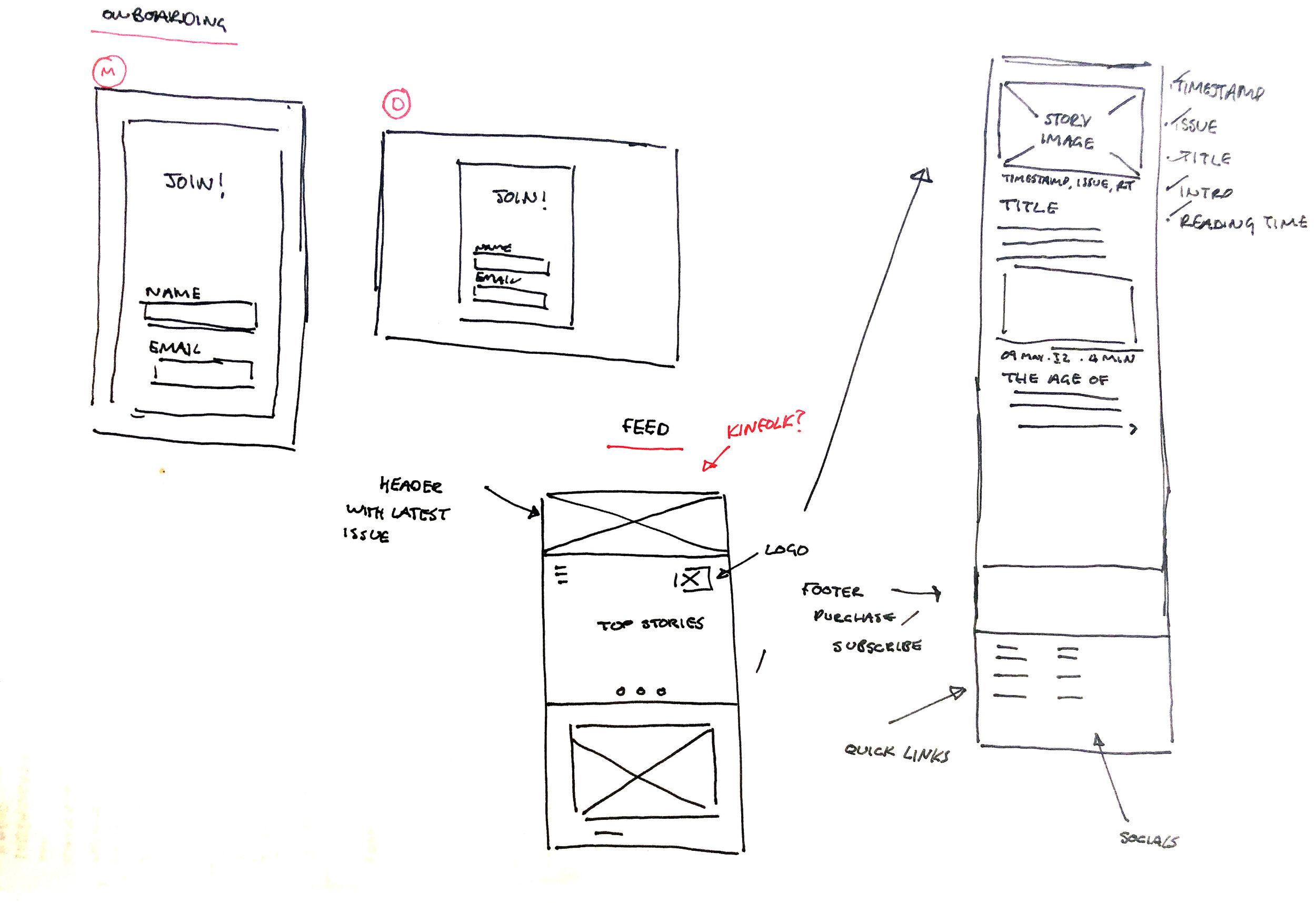
Lo-fi Sketches / Paper Prototyping
After establishing multiple entry points to the site we found 80% of users would enter via instagram after seeing a post which took their interest, with this in mind we’ve decided this is a key area of focus in achieving our main goals:
Convert online readers / followers to paying customers / subscribers
Giving users access to interesting content / helping them read more
Increase brand awareness / online presence
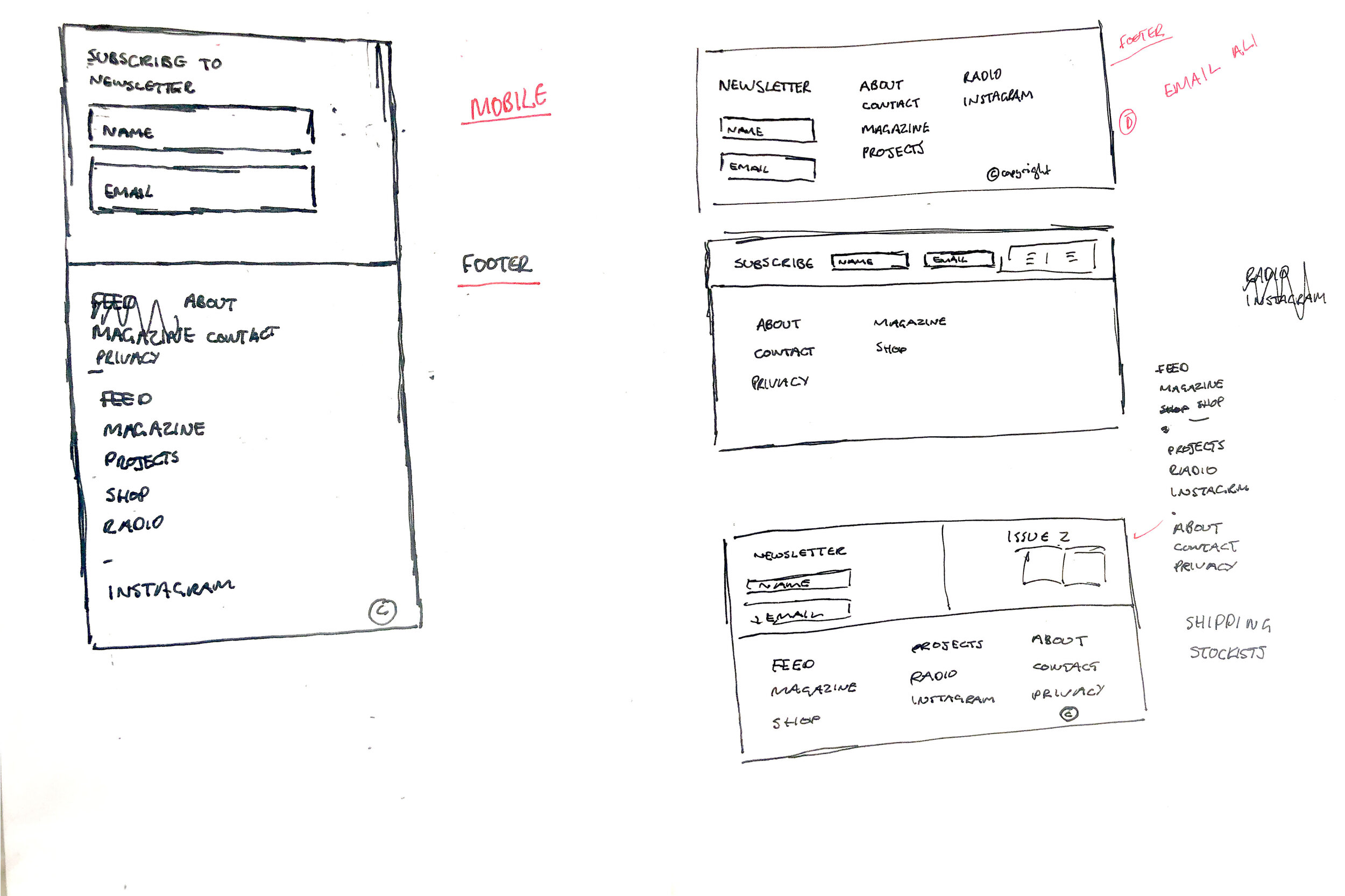
We set about designing an email subscription process which was subtle but everywhere, all of the time in the footer of each page.
To increase our chances we have also included a timed pop up as part of our on boarding process, asking if users would like to join our mailing list.
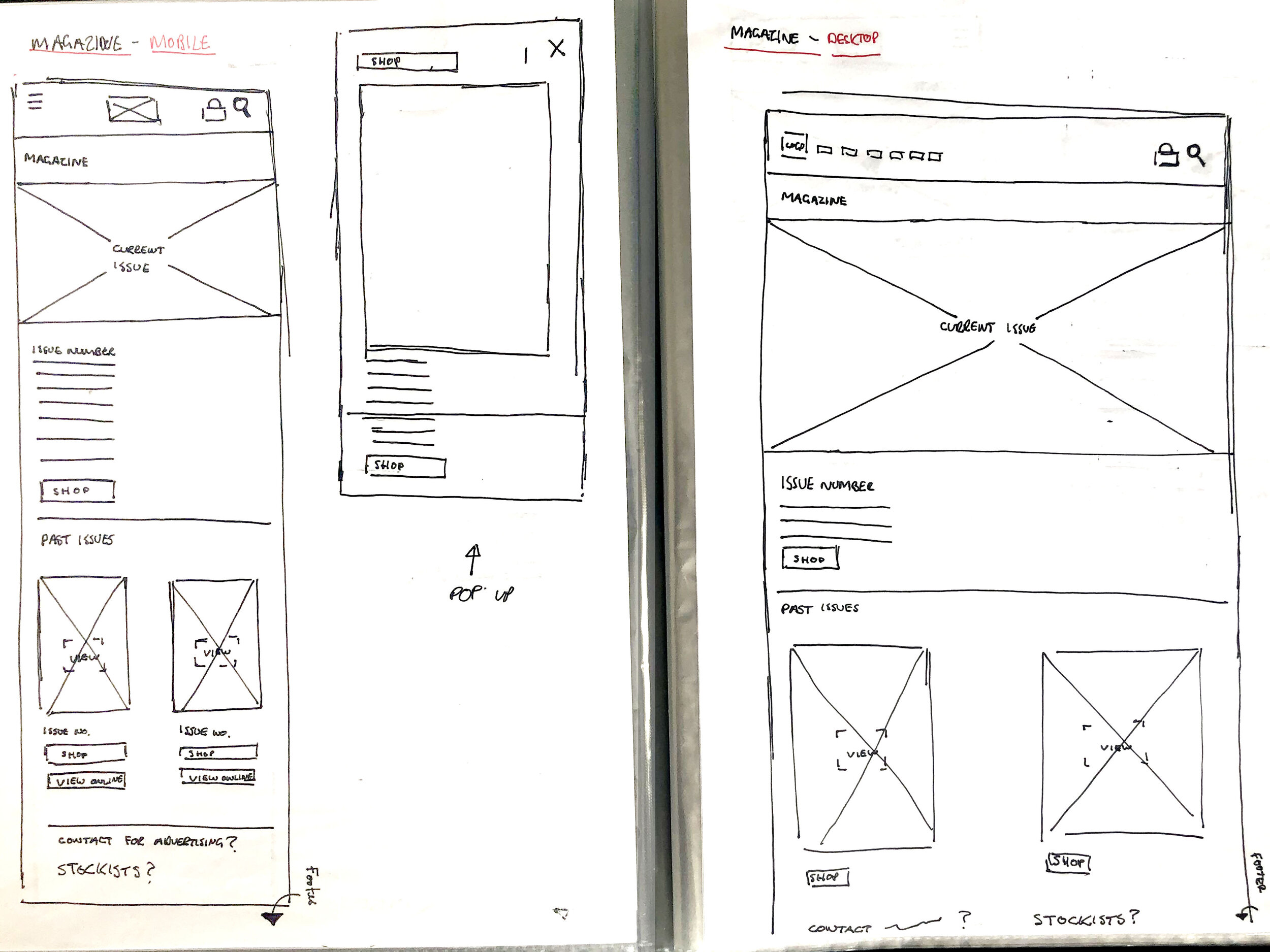
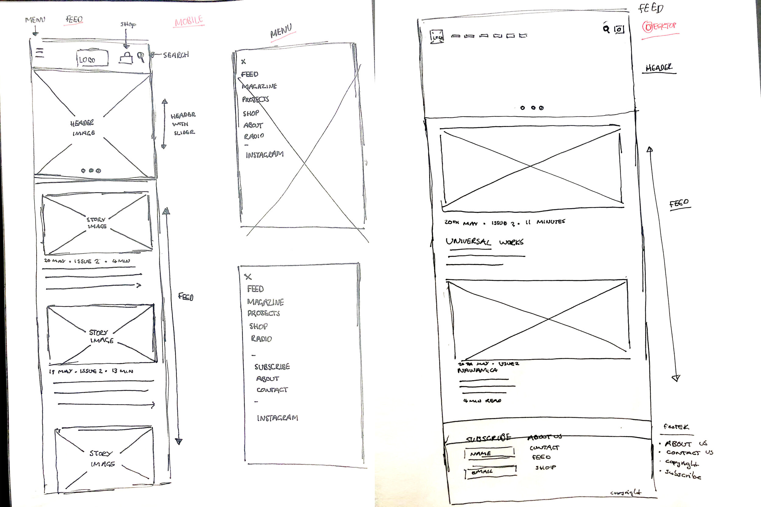
Wireframes

Left: Subscribe Pop-up | Right: Story Screen
Nice Taxonomy eh?

Left: Magazine / Stockists Screen | Right: Read / Purchase Online Screen

Left: Cart Screen | Right: Checkout Screen
(Theres that fancy subscribe section in the footer I was harping on about earlier)
High Fidelity Wireframes

Project Evaluation
While we didn’t uncover anything groundbreaking in terms of UX, we have created an experience which works and the client and end user are happy with. This was the ultimate goal; and personally I thoroughly enjoyed the process.
The build of this site is work in progress. However if we can evaluate where we are currently, we feel its going absolutely fabulous.